Macro website & Micro influencer
-
Client
Angela Argirò -
Areas
Branding, UX/UI Design, Front-end & Back-end Development, Interaction Design, Gestione social & content creation. -
Awards
Special Kudos Award - CSS Design Awards
Site of the day - Mindsparkle Mag

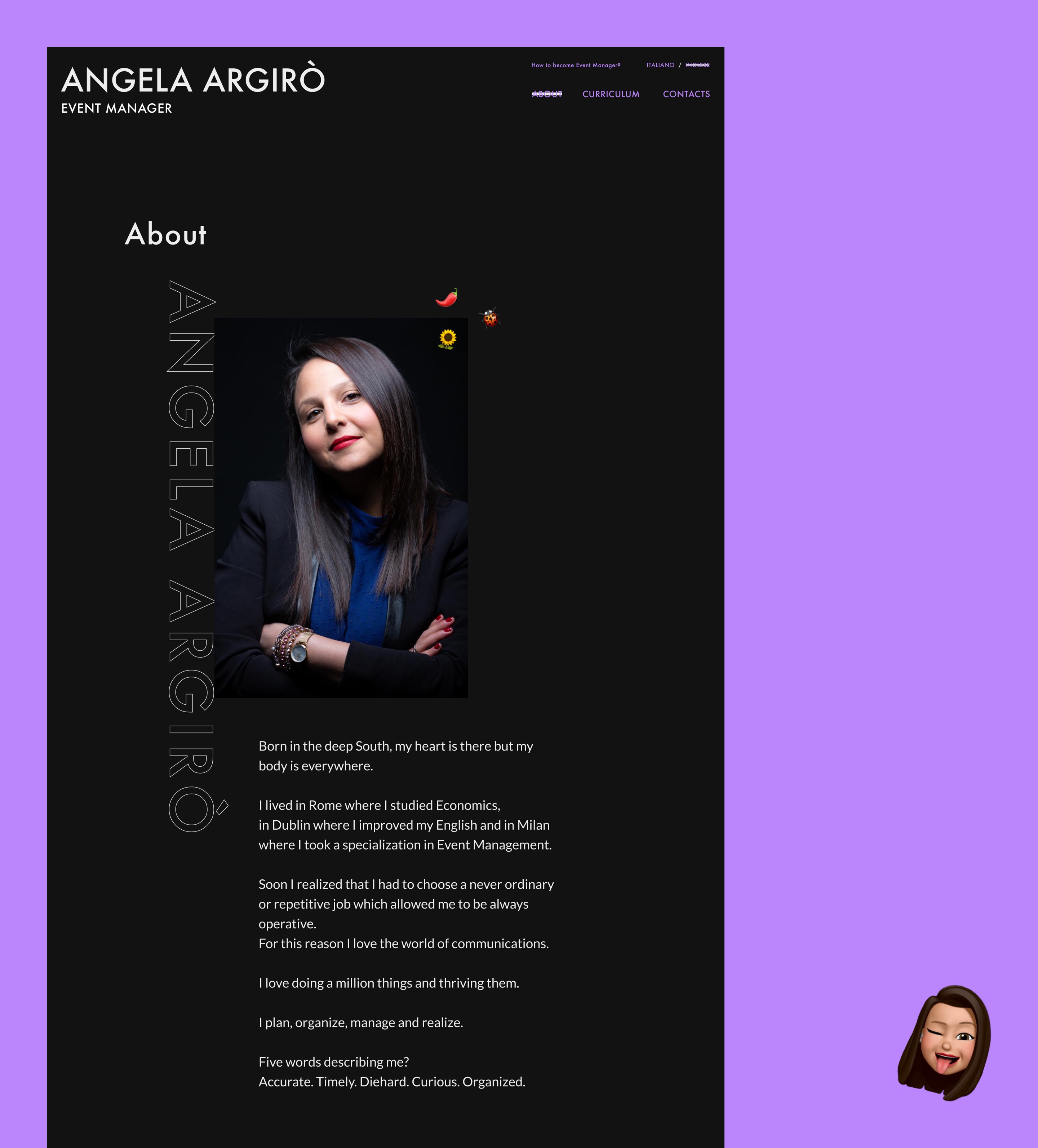
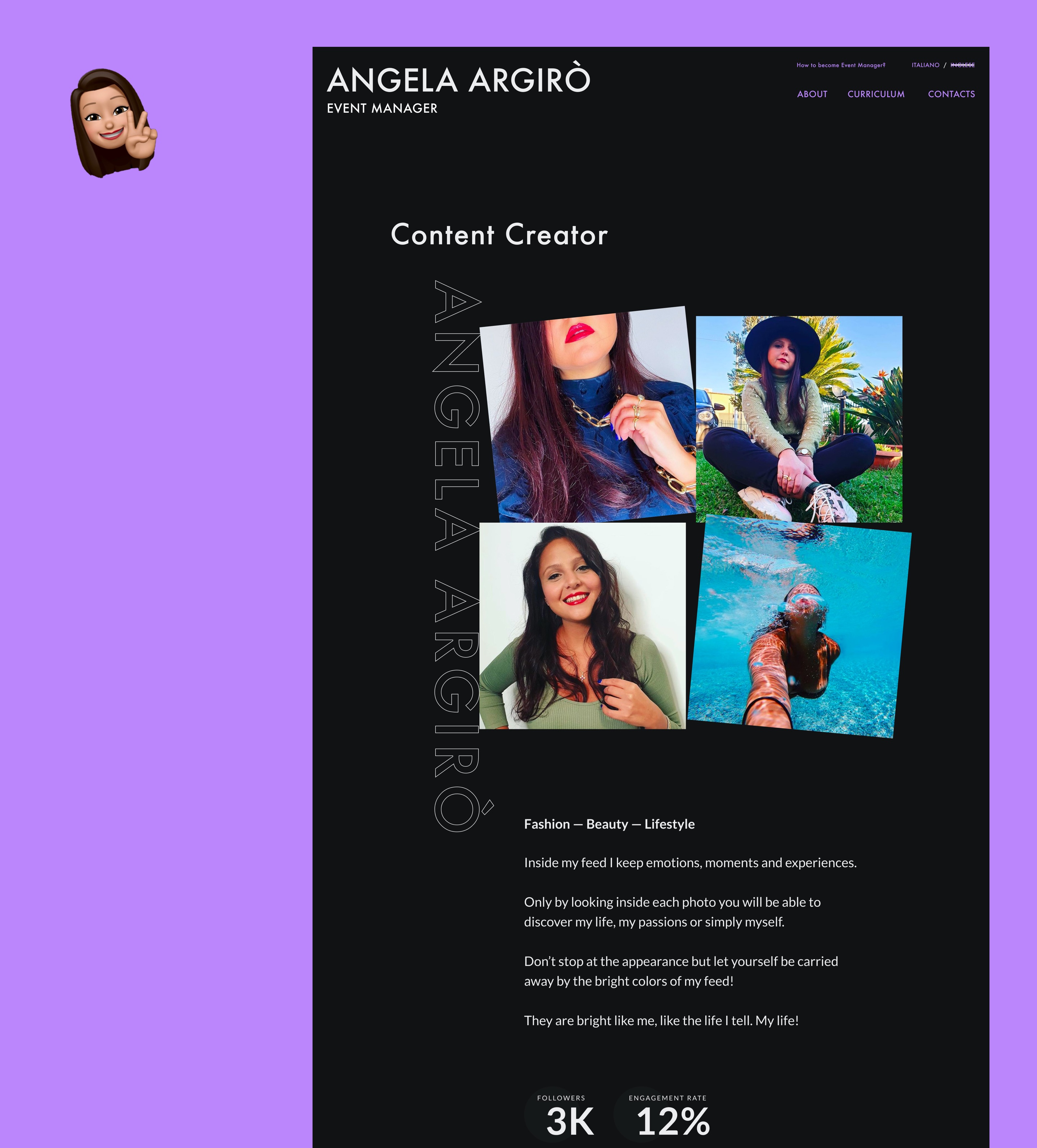
Angela Argirò, event & project manager, co-founder of #00F Agency and content creator needed a portfolio to collect all her professional information and a place to gather all of the event and the event management online courses that she’s realised over the years. On top of this, the website needed to represent her passion for fashion, already visible on her social media channels.

Brand identity & Creative direction
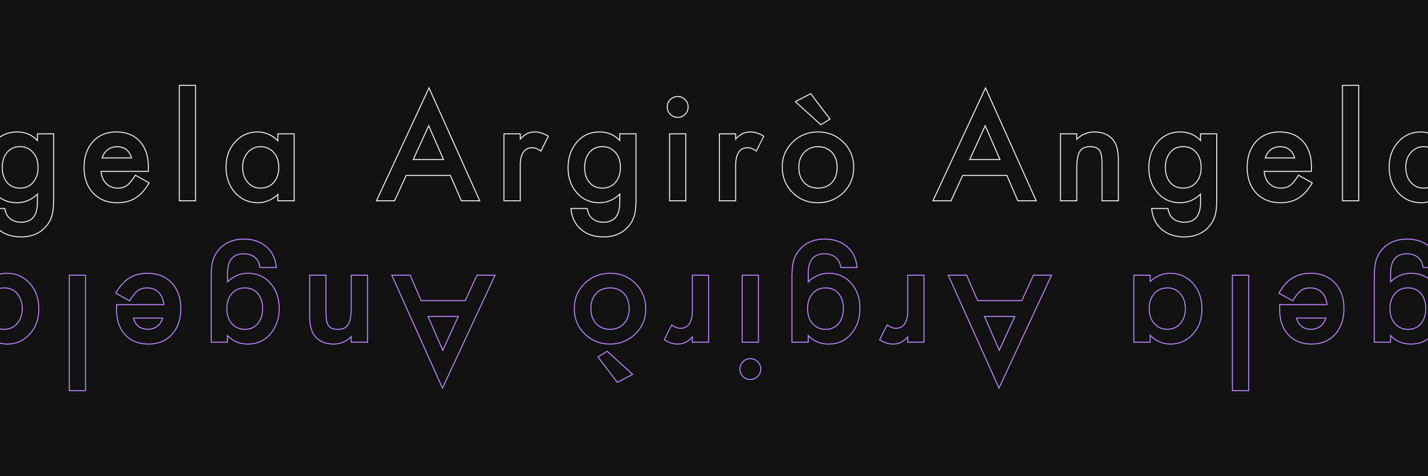
Precision, detail and determination are the guidelines that brought us to the definition of a new and fresh digital image well represented by the choice of a bold typography, full contrast colours, and dynamic image and text that stands out from a dark background.
The animated logo is an essential and precise wordmark that shows all the dynamism of the brand: once hovered, the user can see the shortened version of the logo as in just the initial of the name of the brand. This also makes the logo adaptable to every resolution and platform.
The photography is related to the social media profiles and the event & project managing activities, and it stands out from the dark mode layout thanks to combined animations (scroll effects, rotations, ease in/ease-out). This all together creates a great sense of dynamism to the entire project.
User experience & user interface design
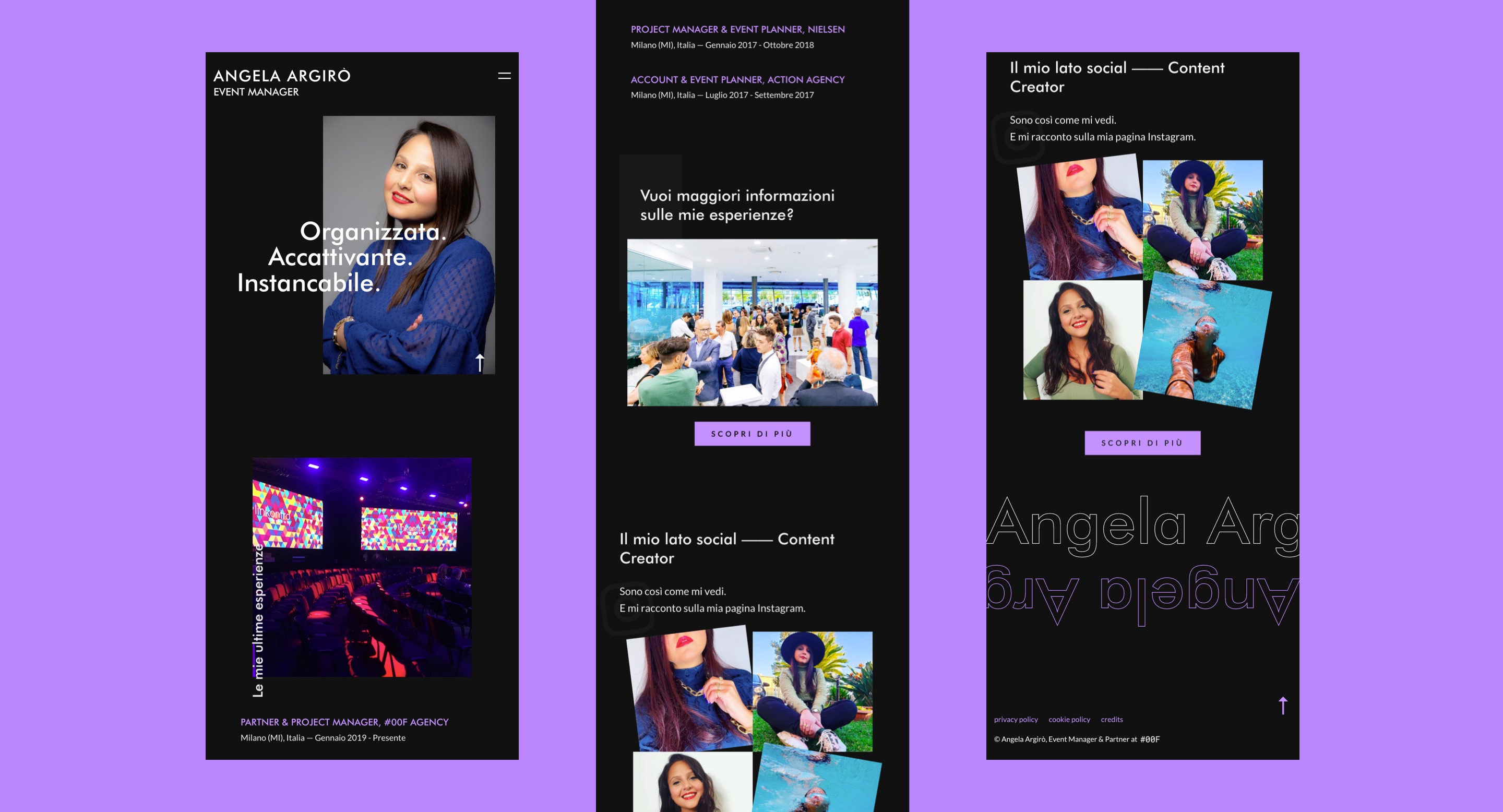
Thanks to the collaborations among our designers and developers, we’ve realised a high profile, mobile friendly and easy to use mobile portfolio. It’ also responsive and scalable on every device, and it guarantees a fluid and immersive experience for the user which is called out to enter an emotional and entertaining yet dynamic journey.
The look & feel of the entire project is on trend and up with the times, and it is based on the personality of its owner: curated to the smallest detail, enriched with micro animations on photography and typography to suggest the idea of dynamism and proactivity.

Development
For the development of the project we’ve chosen WordPress as an open source platform that helped us have great flexibility both front-end and back-end, allowing the creation of a powerful website, entirely bespoke to the client’s needs.
The animations are realised with GSAP, a high performance javascript library that allows the creation of efficient animation, a great contribution to the immersive effect and fluidity we were looking for.

Launch & growth
The new responsive bilingual website brought Angela to increase her work activity and her social engagement. Thanks to the gathering of all her professional information, event management online courses, the new website opened the way to collaborations with several brands like Layla Cosmetics, Tally Weijl, NA-KD, Pandora, Freshly Cosmetics, CeraVe, Collistar.