A website that leaves its mark!
-
Client
Catanzaro Tattoo Fest -
Areas
Branding & Creative direction, UX/UI Design, Front-end & Back-end Development, Interaction Design. -
Awards
Special Kudos Award - CSS Design Awards
Site of the day - Mindsparkle Mag
Catanzaro Tattoo Fest it’s the first convention in Calabria dedicated to tattoos. A three days festival that lets the artist of the ink on skin shine. Giving frame to the event are shows, music, street food and much more.
For its second edition in 2019, they asked us to offer a digital place to the protagonists of the event, the tattoo artist and an information area for the visitors of the convention.

Creative direction & brand identity
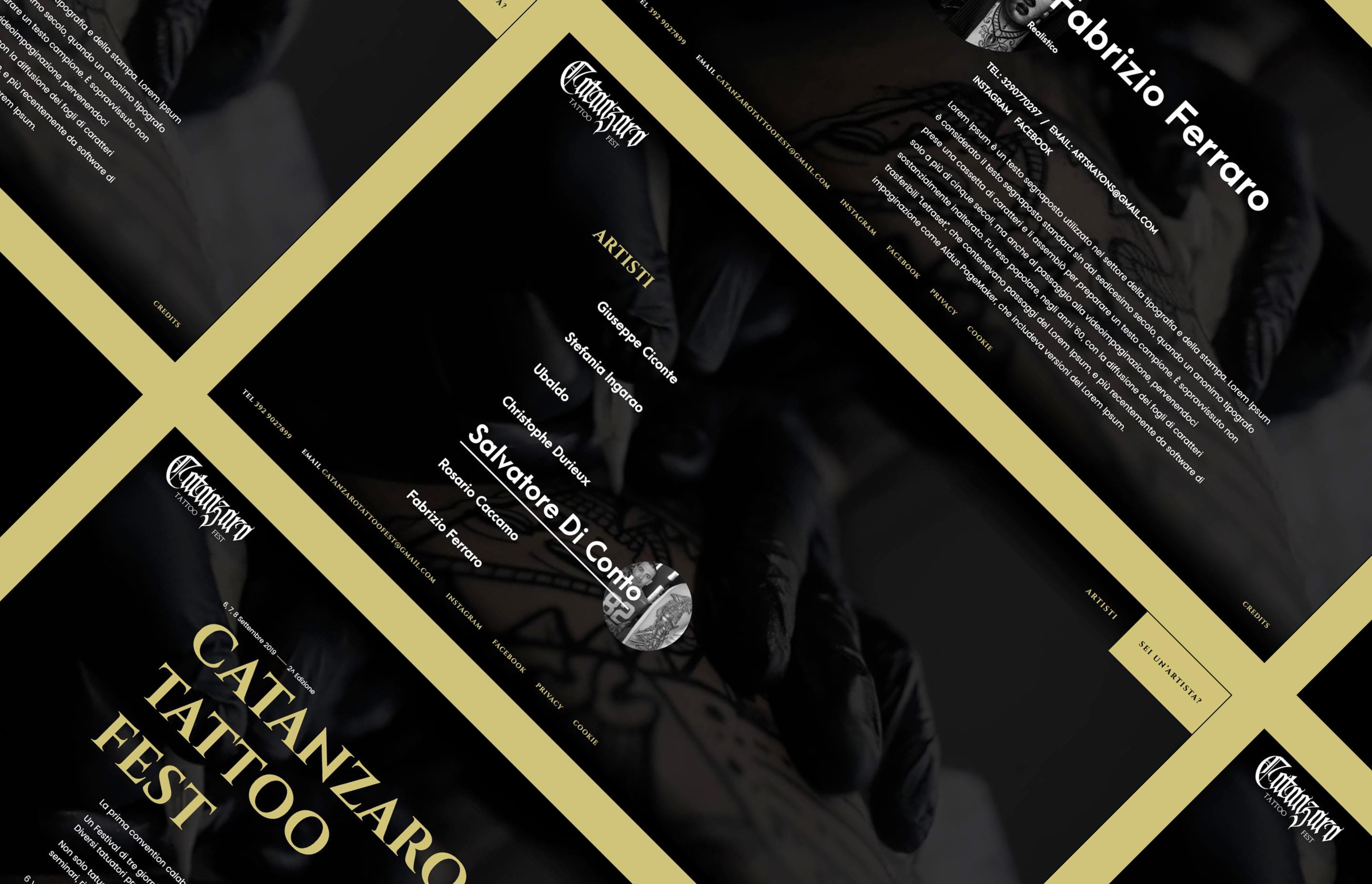
Aiming at putting a spotlight on the protagonists of the convention, we thought of an new immersive design: as a decoy to the saloon atmosphere, we thought of dark tones and an old school stylised typography that is well combined to the Catanzaro Tattoo Fest logo. In the background we decided to go for a close up video of a tattoo artist on work, to give an immediate contextual frame to the entire website.
UX/UI Design
The user experience of this responsive website is simple and intuitive thanks to the accents of colours and the micro-interactions that show the user his happy path to follow. Based on the construction of personas and user journey we designed a double navigation path: the artist section, a personal area where every tattoo artist can express himself showcasing the works, and the event area, where every visitor can get the information on day and schedule on the days of the convention.

Development and technology
We created an intuitive and easy to use registration form for the tattoo artists by using one of the most effective CMS, WordPress. Thanks to the drag & drop functionality it has been possible to facilitate the filling out of the form and the upload of the content.
Once the form is filled, all the data are sent to the company, thanks to an integrated system that allows to collect all the information with no data loss. The organisation can now get in touch and finalise the deal for the convention, adding the artist autonomously in a dedicated page with all the related profile information.