Corporate website for the private investment holding
-
Client
WindeX -
Areas
Digital Identity (Logotype, Fonts, Color Palette), UX/UI Design, Front-end & Back-end Development, Interaction Design.
WindeX is a privately owned direct investment holding specializing in private equity, founded by a group of entrepreneurs with extensive industrial and financial experience.
Aiming to elevate its online presence to the same level as its expertise, WindeX turned to #00F and found the ideal partner to streamline its digital identity and design a new website that showcases its business achievements.

Digital Identity
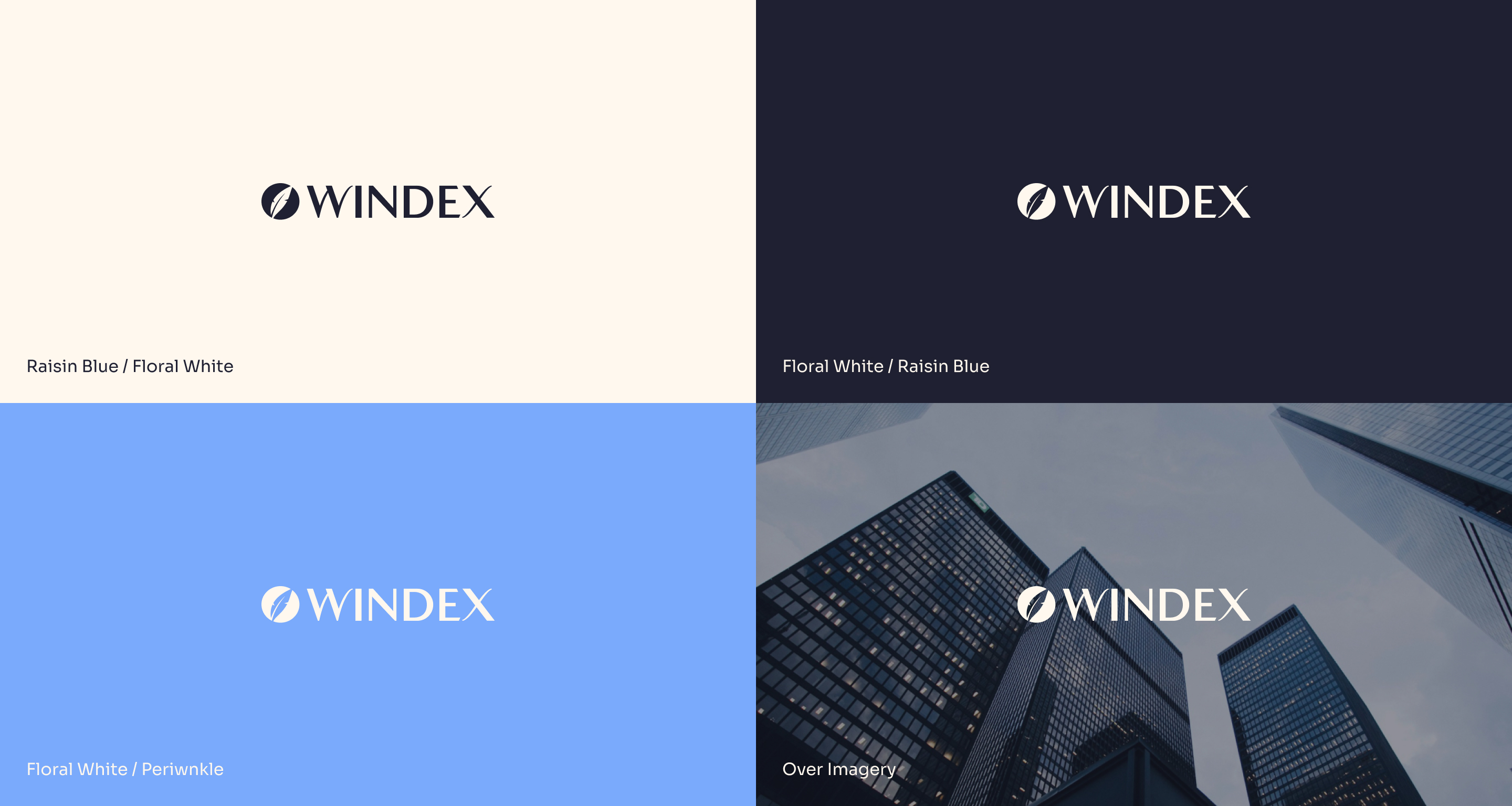
The work on the digital identity began with an in-depth study of the logo to identify areas for improvement and optimization without altering the company’s distinctive mark.
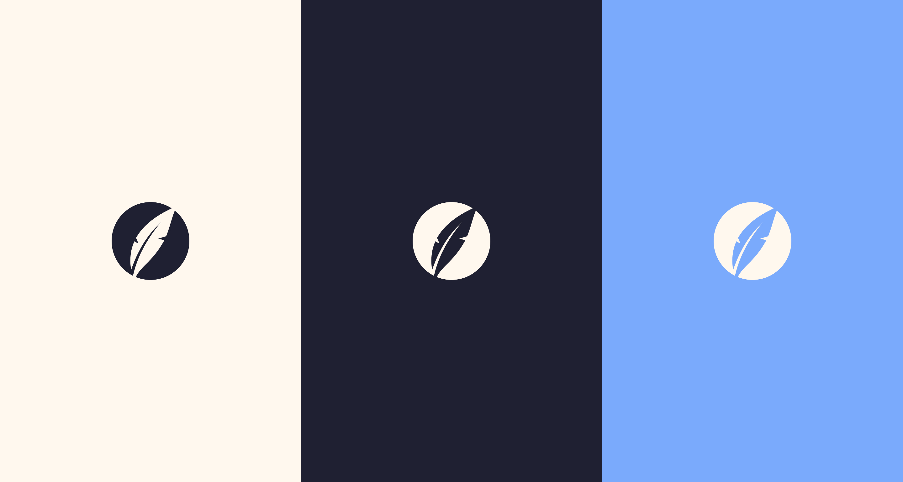
Next, the pictogram—represented by a leaf—was modernized and aligned with the new logo to ensure coherence and usability across all devices.
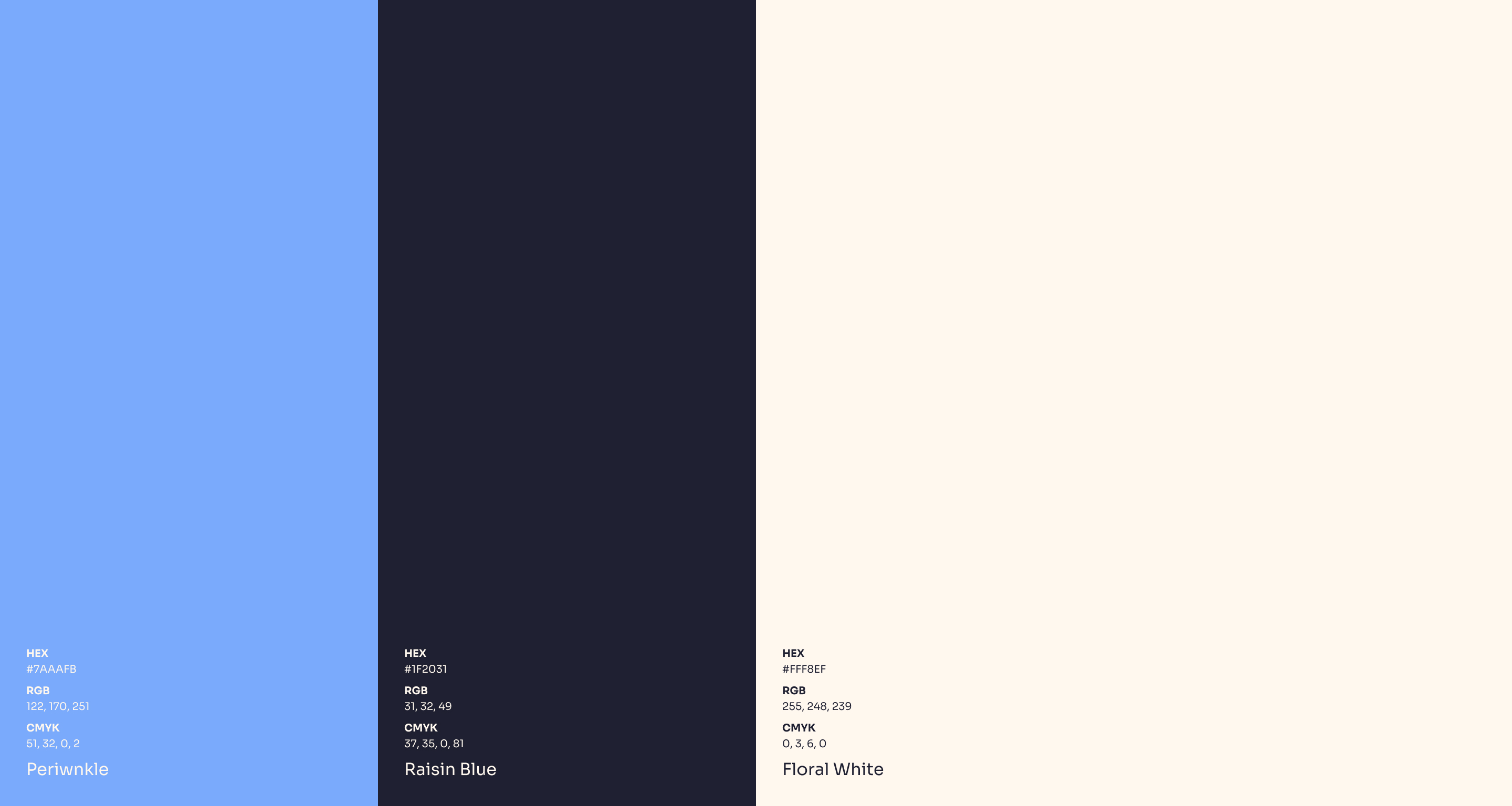
A new color palette was selected to convey trust, reliability, and professionalism—values effectively communicated by shades of blue such as Raisin Blue and Periwinkle.
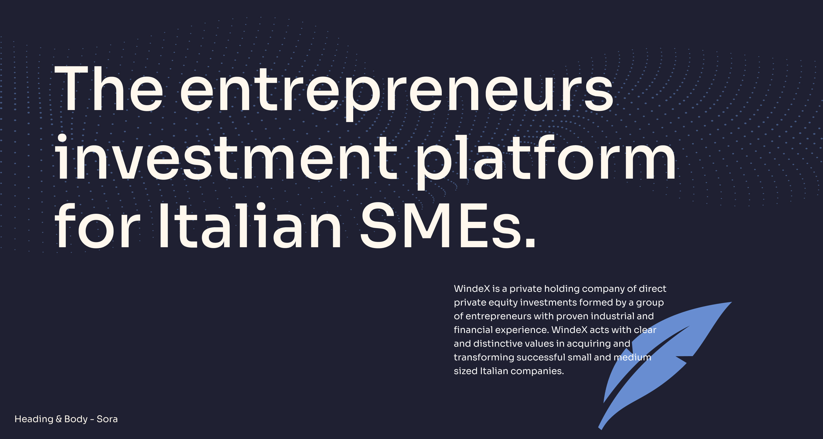
The typographic choice fell on “Sora,” a Google sans-serif font whose geometric shapes ensure perfect readability on every device.
Website
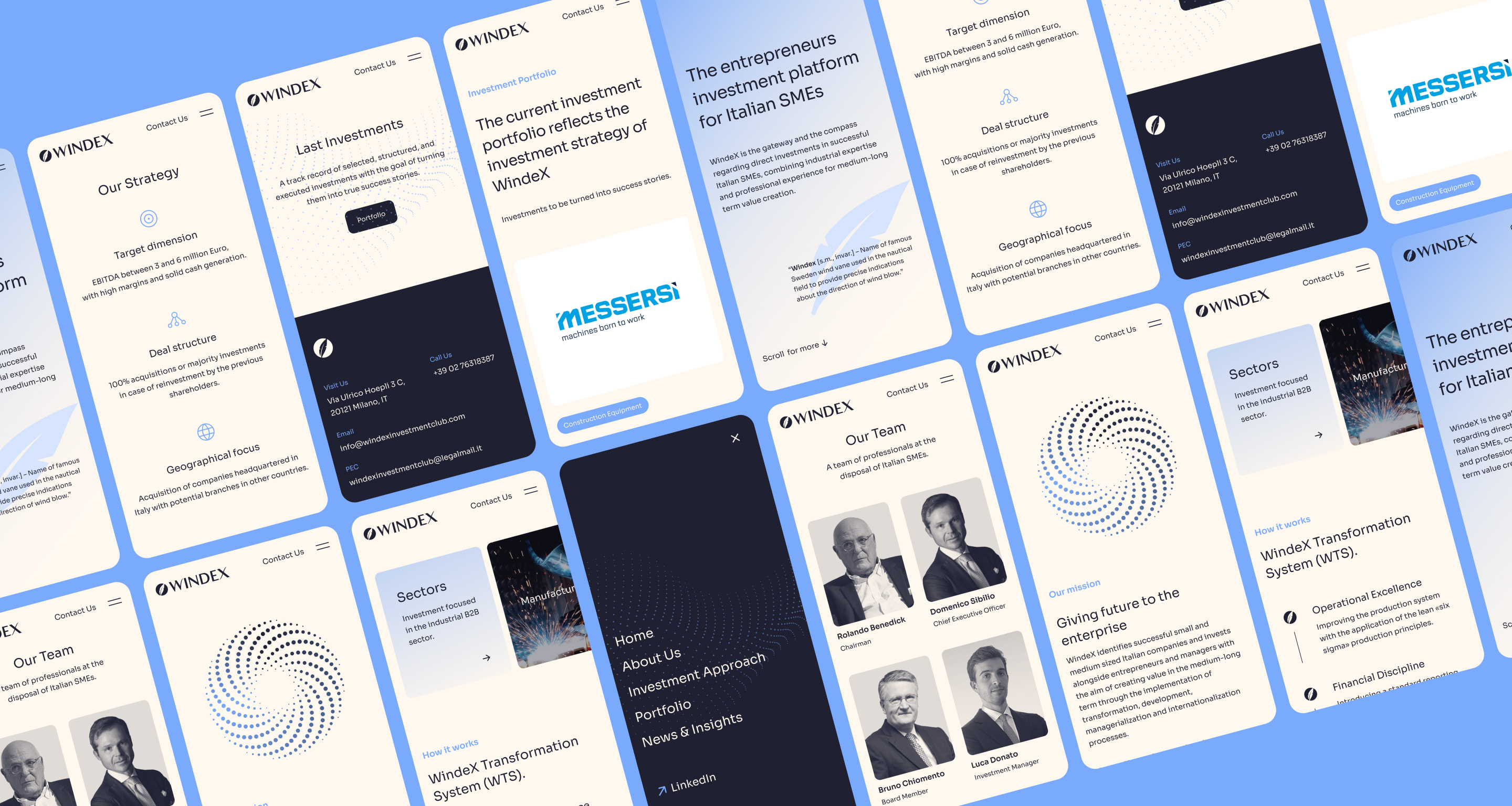
The new website was redesigned starting with a co-design session, during which we defined objectives and functionalities for the new platform.
It became immediately clear that the investment section needed to be reworked to better communicate the characteristics of each investment.
Special attention was also paid to the team section so that any user interested in WindeX would quickly understand the expertise of each company member.
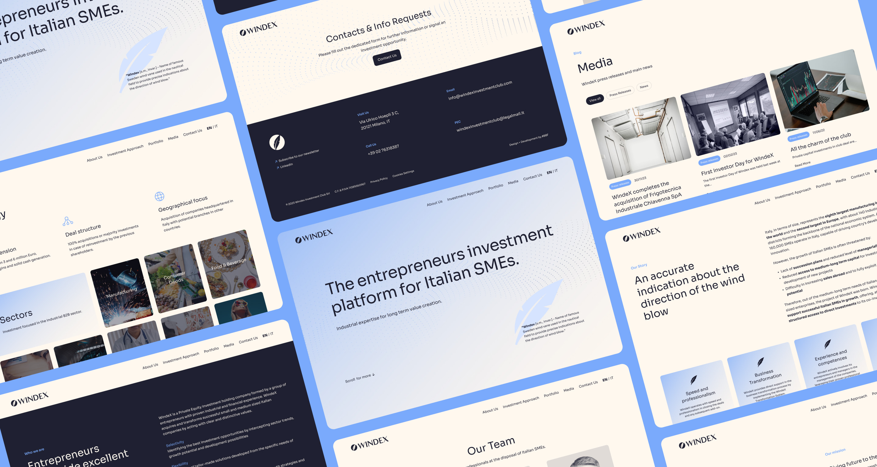
#00F handled the custom WordPress development of the website, leaving WindeX fully satisfied. As a result, they decided to continue the partnership with #00F, entrusting the digital agency with the ongoing WordPress assistance and maintenance of the site.
