A bold website for a bold fashion creative company
-
Client
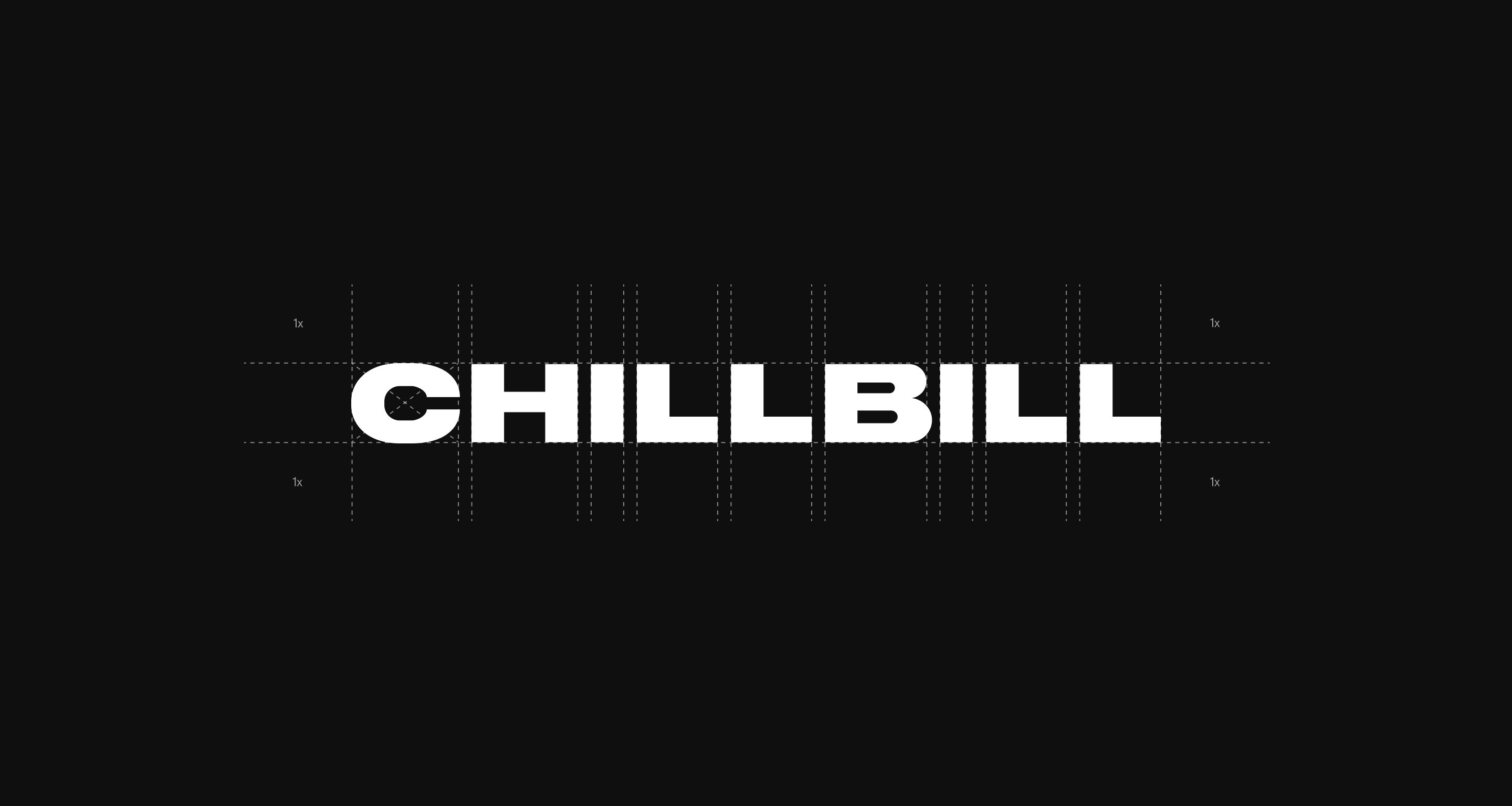
CHILLBILL -
Areas
Branding (brand strategy, brand identity, brand book), UX/UI Design, Front-end & Back-end Development, Interaction Design. -
Awards
Honorable Mention - Awwwards
Special Kudos Award - CSS Design Awards
Site of the day - Mindsparkle Mag

Intro
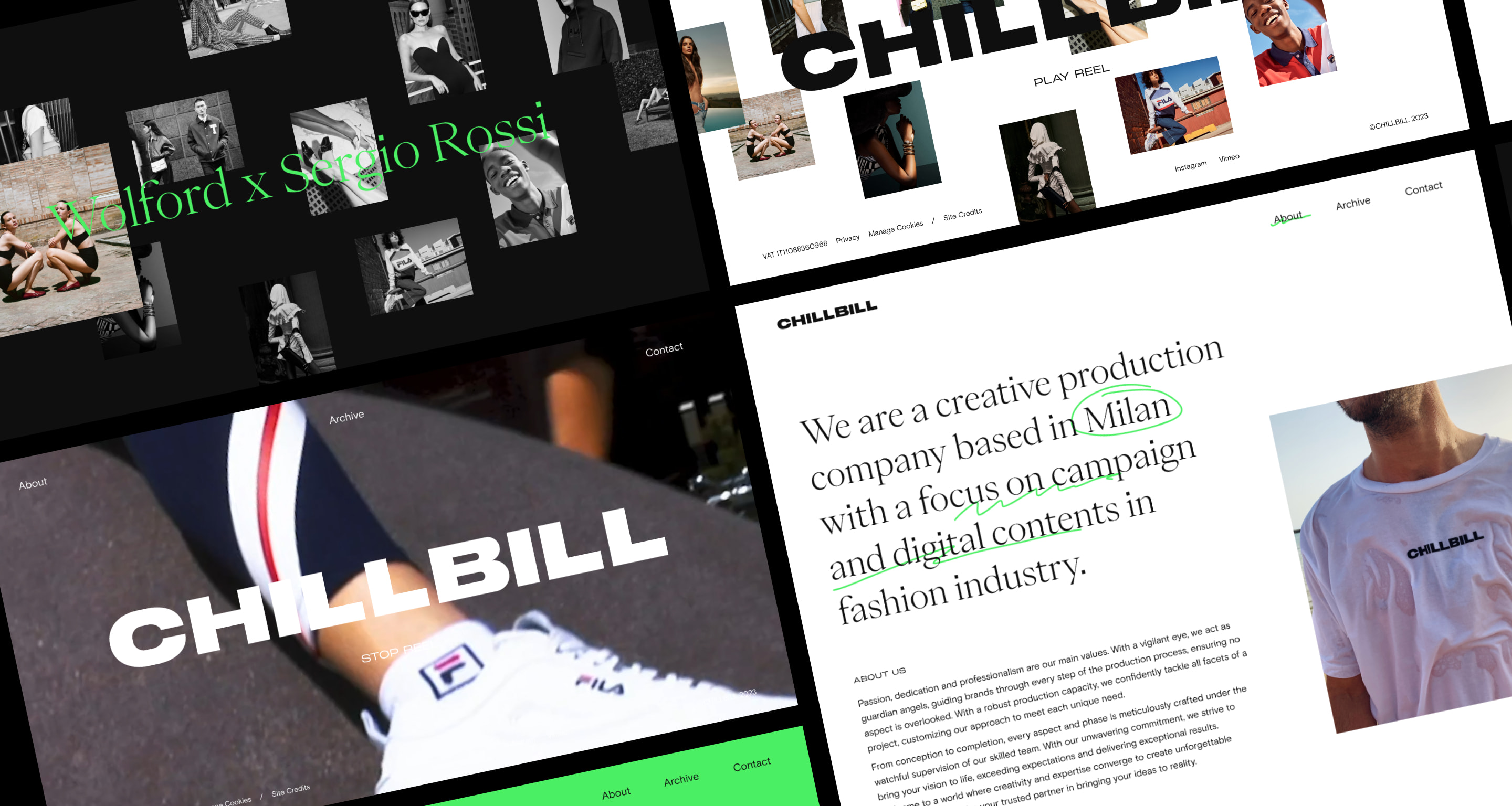
CHILLBILL is a creative production company that creates campaigns mainly for fashion clients.
In 2023, CHILLBILL, a leading creative production company specializing in fashion campaigns, was looking for a dynamic Milan-based creative agency to partner up with for a pivotal rebranding and website overhaul. With #00F emerging as the perfect collaborator for this transformative journey, our shared objective was to redefine CHILLBILL’s brand identity, showcasing its unmatched proficiency in production and fashion-forward approach.
Branding
The rebranding began with an in-depth self-analysis that the founders of CHILLBILL carried out on their brand, providing the foundation for a comprehensive and collaborative workshop guided by #00F. This workshop aimed to craft a compelling narrative and uncover the core identity of the brand.
Empathy, trustworthiness, adaptability, and energy emerged as the core values that CHILLBILL wanted to convey through their new brand identity.
An identity that encompasses a harmonious mix of creativity, professionalism and a fashion-focused appeal, while at the same time conveying a relaxed and approachable demeanor.
A fusion of contrasting elements, including typography and color, was the key elements to convey a contemporary and fashion-oriented look, aligning seamlessly with CHILLBILL’s core values.
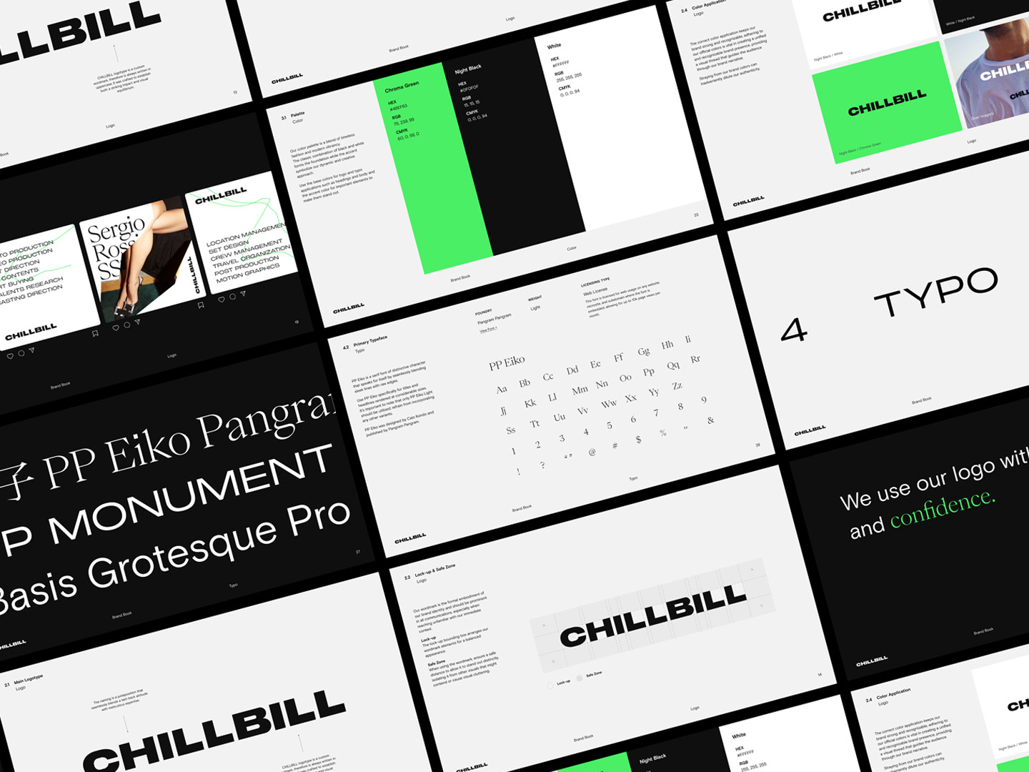
The dynamic visual style was crafted through a careful selection of fonts, blending the elegant lines and raw edges of PP Eiko with the robust versatility of PP Monument Extended. Additionally, the inclusion of Basis Grotesque Pro, chosen for its exceptional readability, further amplified the brand’s overall accessibility and visual appeal.
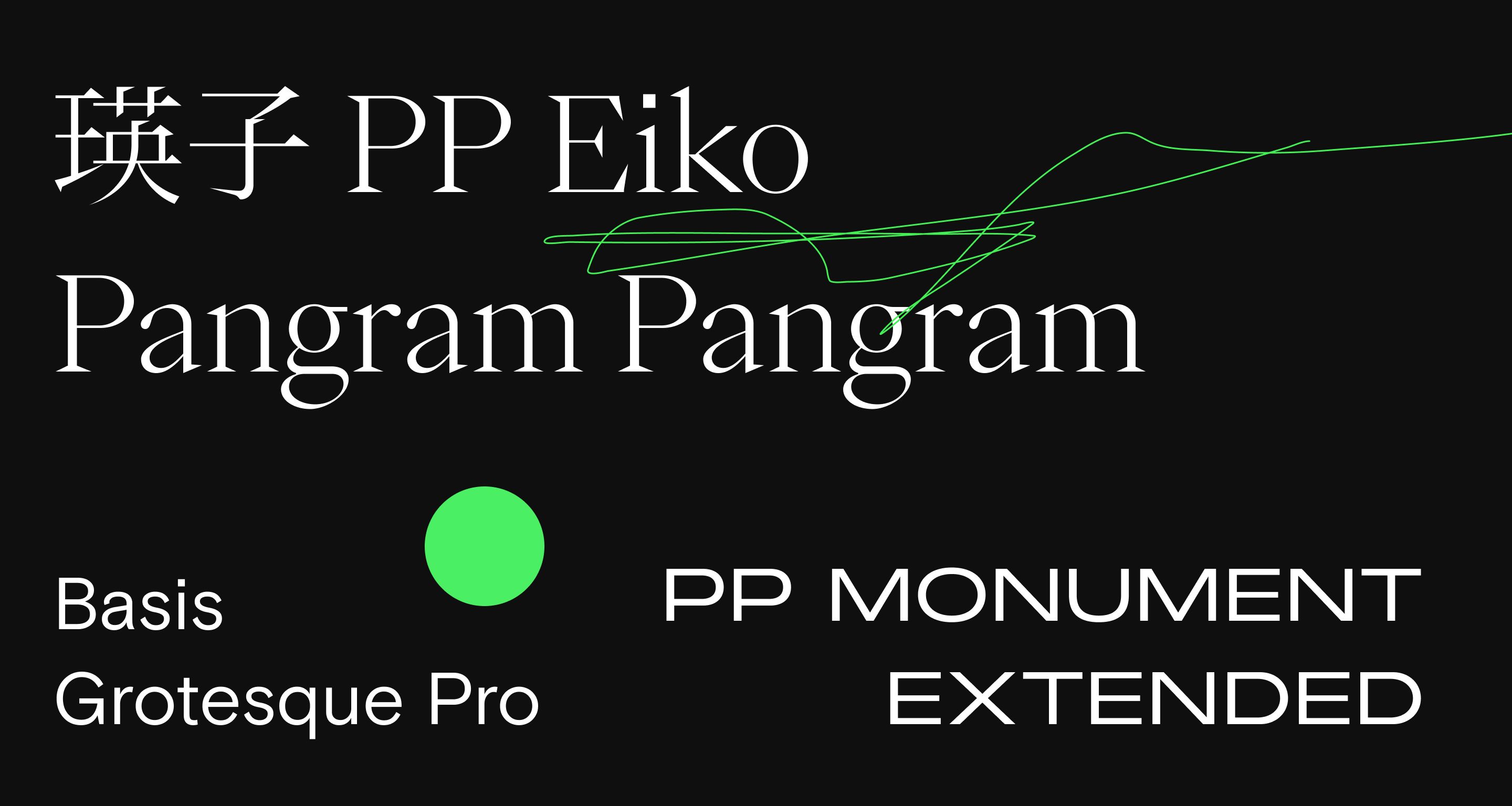
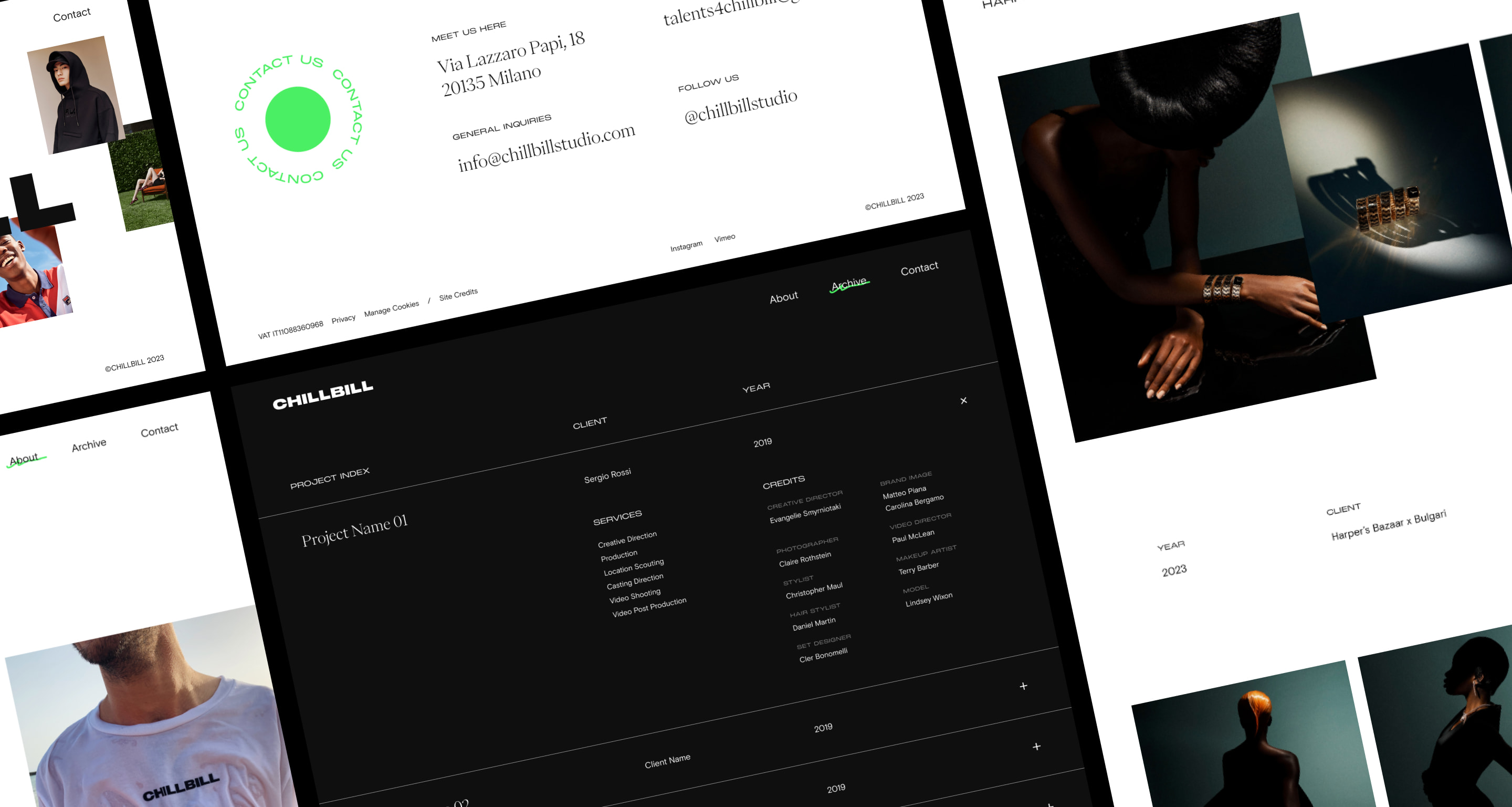
The color palette was outlined with the choice of black, a versatile and familiar color in the fashion sector; white to give a minimal look and chroma key as color accent which, with its vivid hue, refers to the green screen, an essential element in the production industry.
User experience & User interface Design
Through a meticulous restructuring of the information architecture, we streamlined the website’s functionality. By meticulously mapping out user navigation flows, the redesigned interface seamlessly guides visitors through CHILLBILL’s diverse projects, effectively showcasing the company’s expertise in fashion content creation and beyond, ensuring a seamless and immersive user experience.
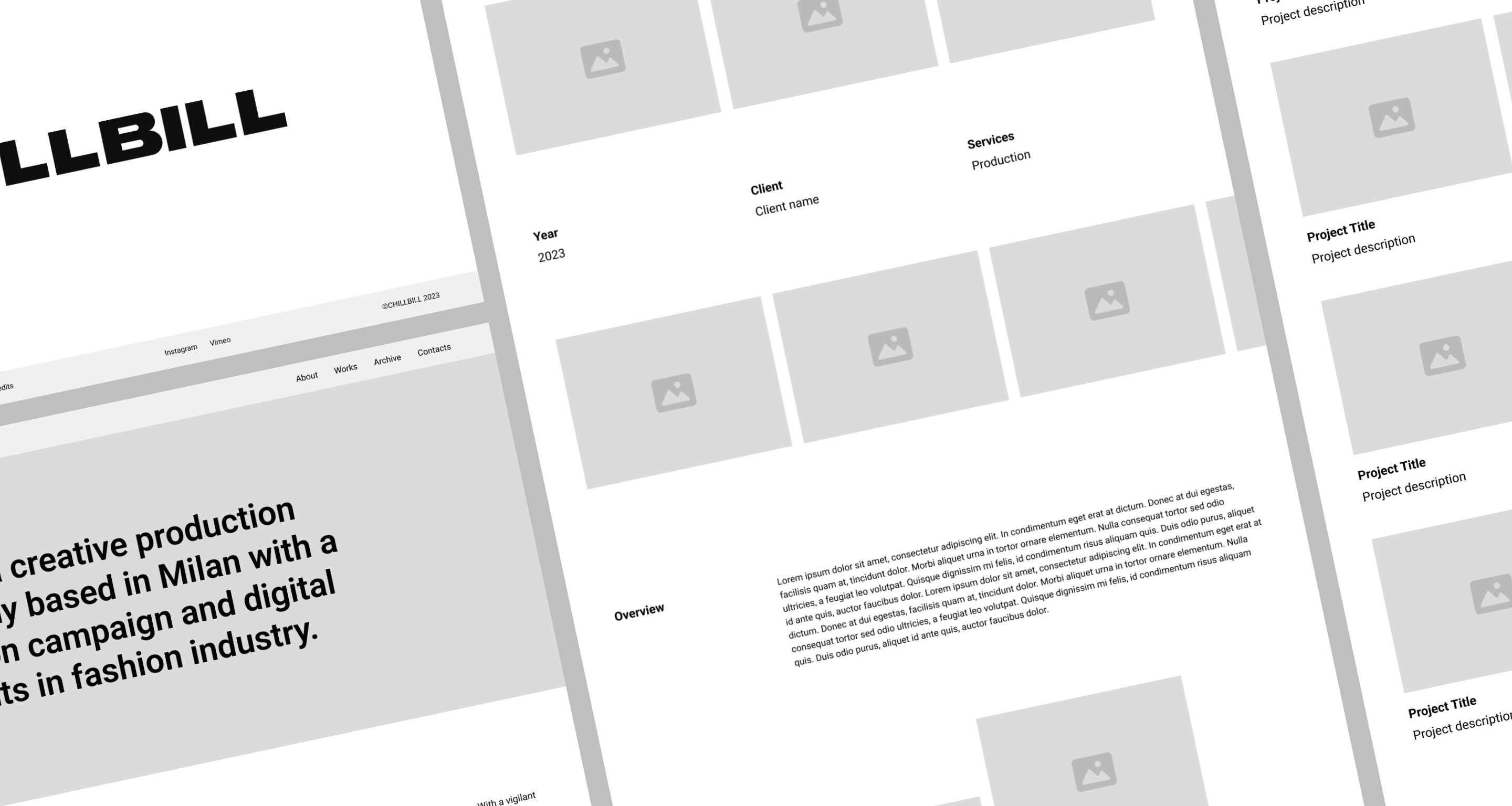
Aligned with the branding ethos, the user interface seamlessly integrates typography and chroma green accents. Embracing a minimal yet unconventional aesthetic, the website exudes a distinctive allure, with subtle details adding an element of surprise. The dynamic and creative portfolio further amplifies the immersive user experience.
Development & technology
The previous technological choice was limiting for the growth of the brand. The Wix site builder, on the one hand, allowed CHILLBILL autonomy in managing the website, on the other, the low degree of flexibility and customization of the platform was no longer up to the level of the production company.
With the development of the new website we aimed for a solution that would guarantee the same autonomy but with maximum customization.
The new technological choice was WordPress, a CMS famous for its versatility and flexibility.
A custom project in both WordPress design and development.
The team of our digital agency has created dynamic pages with modular sections to give the customer the possibility of updating the website independently and presenting each project in a personalized and different way.