E-Shop the “Dirty look”
-
Client
Metalgienchi -
Areas
Front-end & Back-end Development, Interaction Design. -
Awards
Special Kudos Award - CSS Design Awards
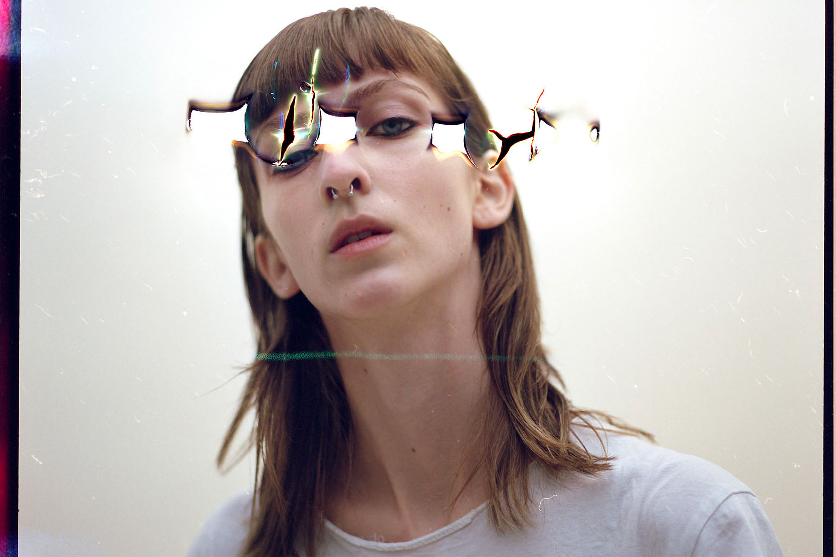
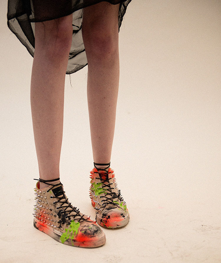
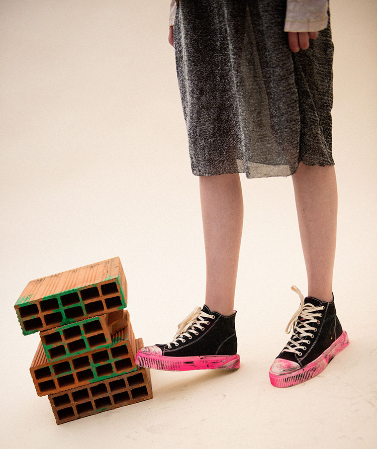
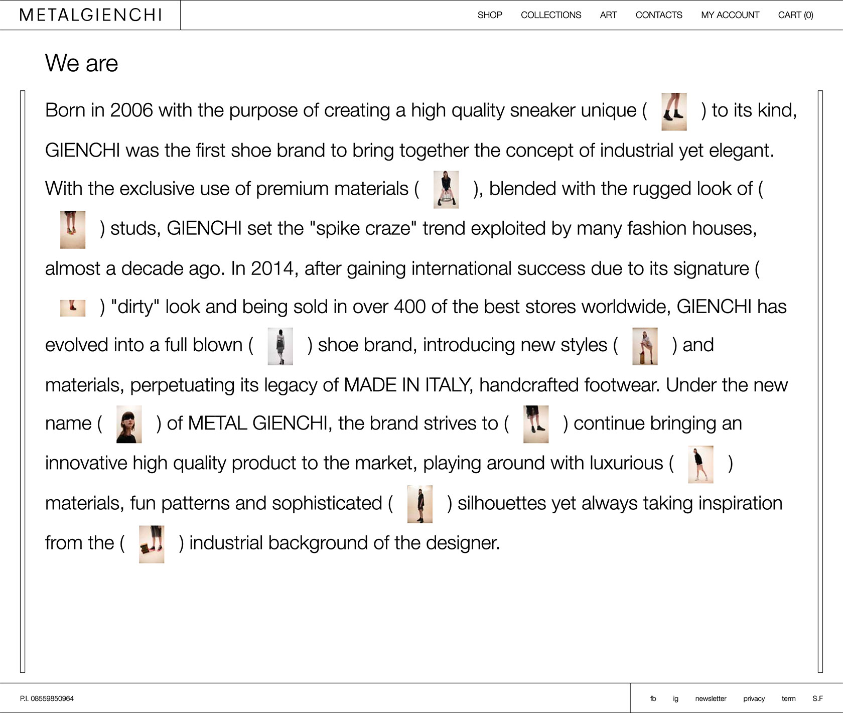
Metalgienchi, founded in 2006, it’s the first company in Italy that merged industrial design with quirky fashion in the footwear world, combining first quality materials to the famous “dirty look”.
The challenge was to convey the innovative and edgy style of the brand within an e-commerce website that could break the mold but keep at the same time a familiar navigation and patterns to guarantee the best user experience.
Branding & Creative direction
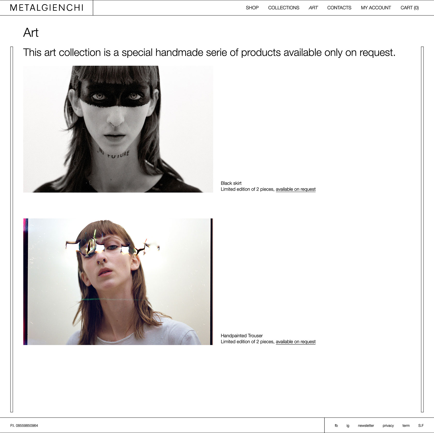
The project has been designed as a decoy to the Swiss brutalist graphic design, with its raw and chaotic elements, in collaboration with Studio Fantastico. The goal was to get out of the ordinary and bring a unique fashion e-commerce to life.
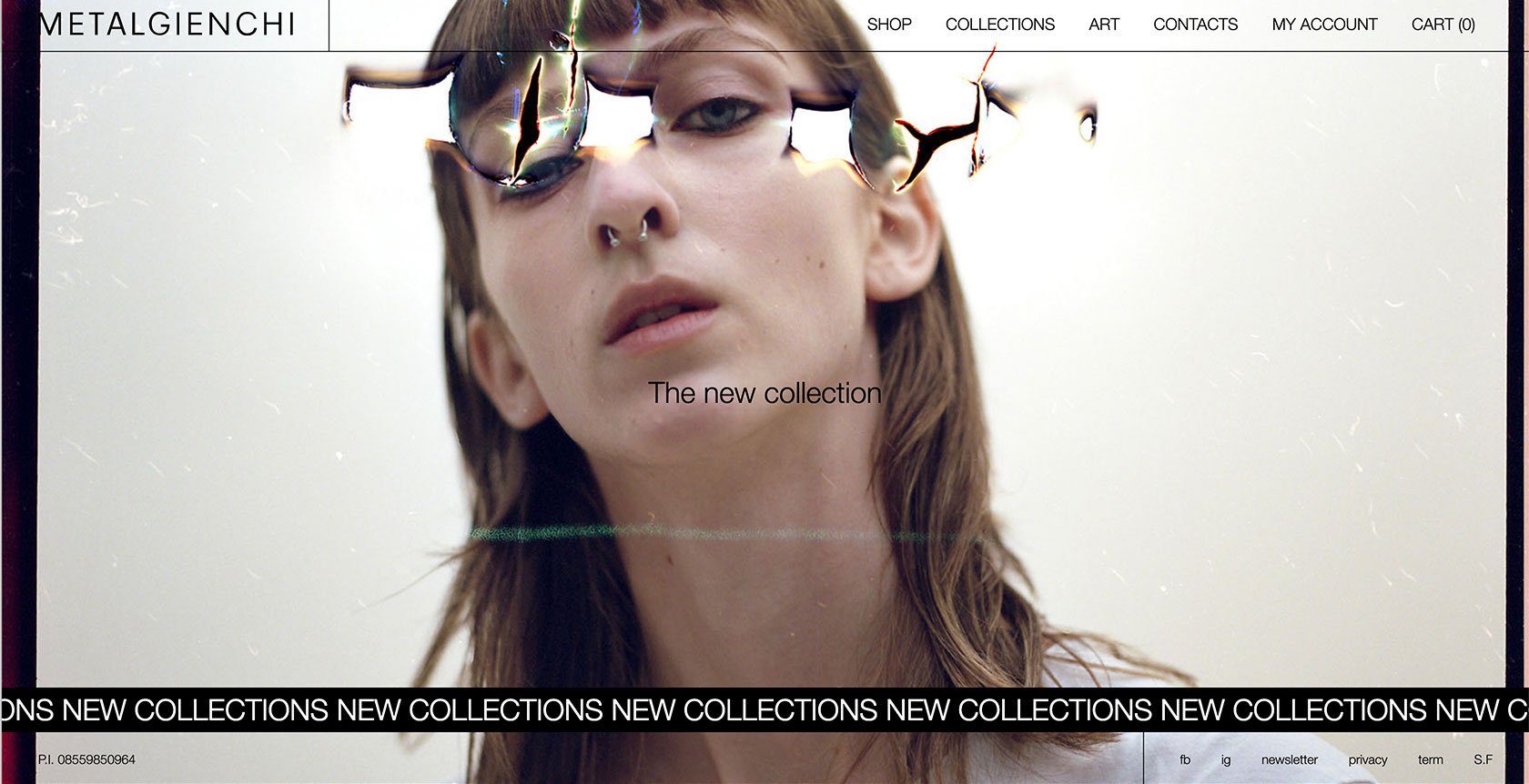
The rough typographic approach goes hand in hand with a photographic style that recalls the underground culture. All these elements break the classical layout, playing with an organised chaos and giving a rough and sharp image. To let the brand shine, we’ve also created a loader inspired by the paper in which every product is wrapped, so that every load of the page works on the brand awareness.
UX/UI Design
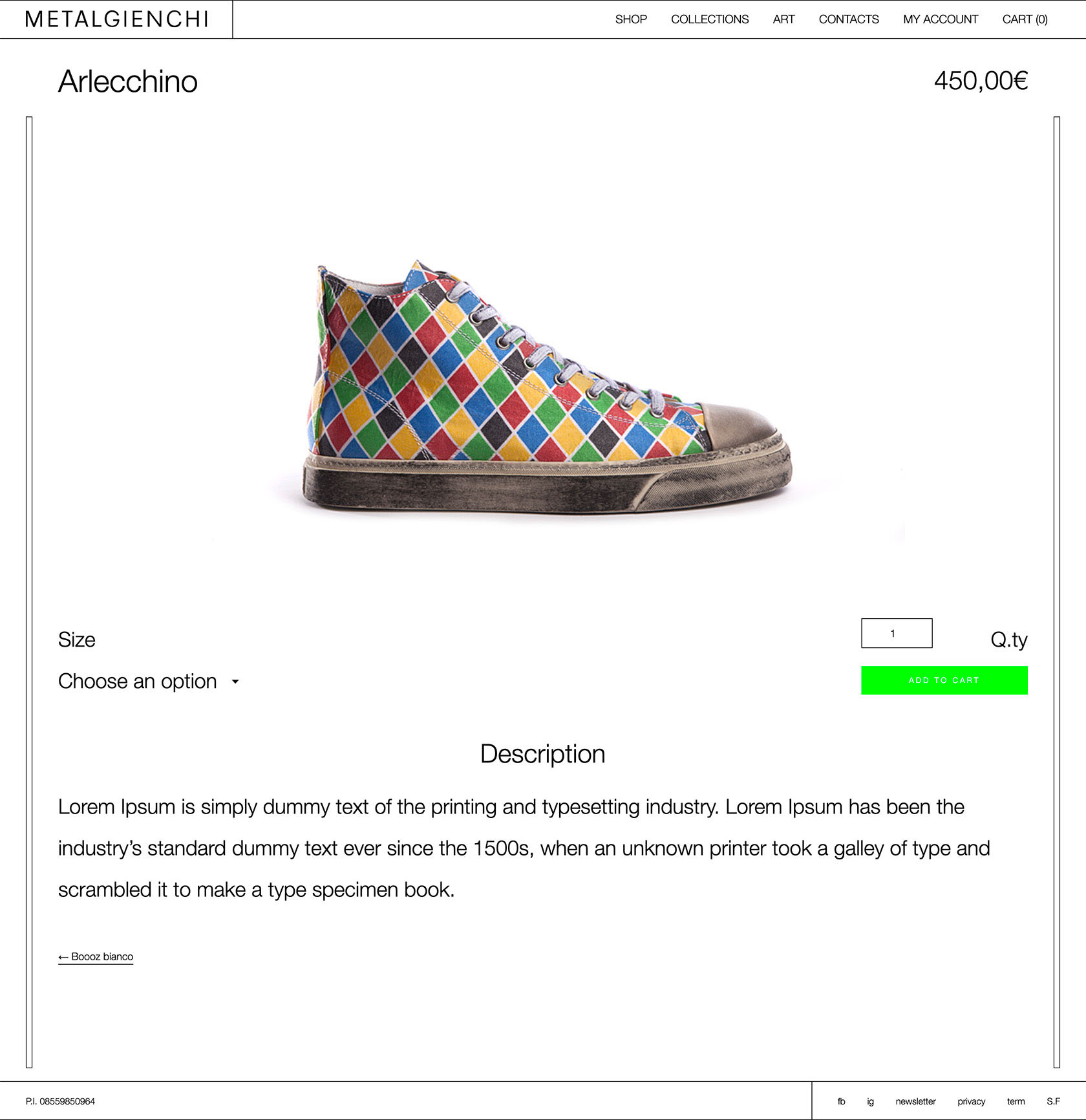
Metalgienchi is a fashion responsive e-commerce è un fashion e-commerce that breaks the mold with consciousness: in compliance with the usability rules, it plays with UI elements that seem to be out of place across the all website, and in so doing it vehicles the identity and emotional aspects of the brand. Thanks to a collaborative and lean design approach, on every step of the shopping experience, a satisfying and immersive navigation for the user is reached.
Growth and development
For the development of the e-commerce website, we chose to combine WordPress and Woo-commerce. From this match, we’ve created a highly customised website thanks to the specific functionalities that have been implemented in the back end.
The flexibility, both in back and front-end, allowed our client to be independent in the management of its own business.